Mobile search interaction is pants
The founding father of search

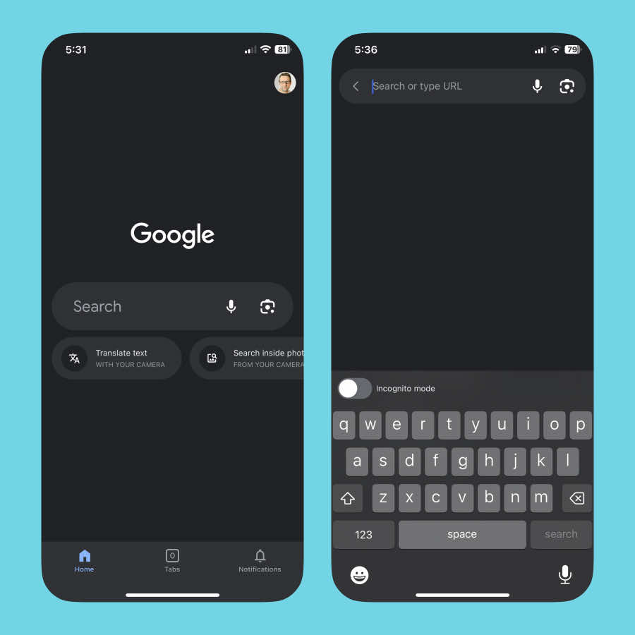
Let’s start by considering the most famous search box in the history of the internet: Google.
A significant amount of articles have been written that describe why this page is successful for search. And the general consensus is that the simplicity of the page is its killer feature.
It’s simple in terms of page layout - obvs.
But think about the interaction here. And I’m specifically talking about when it’s used on mobile phones.
Google have positioned their search input halfway down the screen. It’s within reach of your thumb - great!
And in one single tap the input is focussed, the keyboard is revealed, and you’re ready to type your search query.
You would think this specific user experience would be copied across all mobile interfaces, but it seems the great Google search box isn’t as influential as it could be.
Search interaction on other apps
Now let’s look at some other widely-used mobile interfaces and see how they’ve approached search.
I’ve noticed that none of them match the positive user experience that Google have built, and there’s really no excuse for this failure.
I’ve also noticed there are two approaches that many apps take. They’re either making the search box reachable, or focussed in one tap.
But never both - like Google.
The Reachable approach

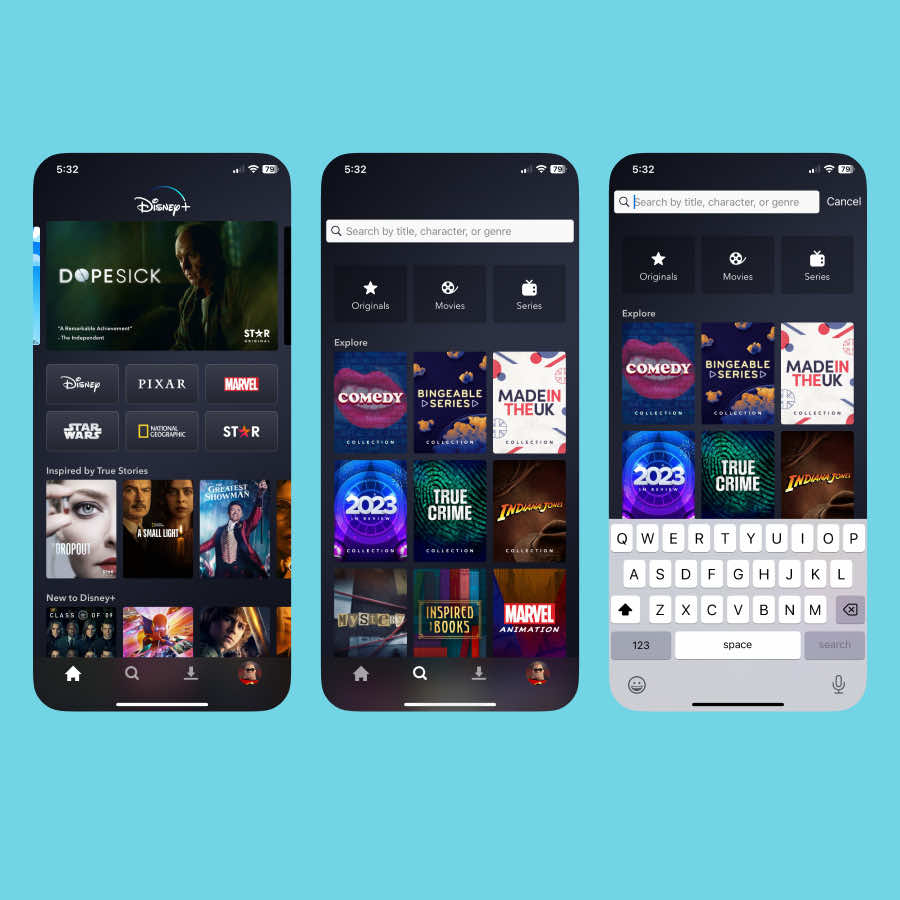
When major apps place the search feature within reach of your thumb, that usually means it’s an item in the tab bar at the bottom.
Now, this tab isn’t a search input, it’s a tab. And it’s treated as such in these instances.
Users tap this tab, and are shown the search page.
By tapping the search tab, users are telling the app that they want to search for something, but the keyboard remains hidden 🤨
Instead, the search page is full of suggested content, and the search input is now revealed.. at the top of the screen!
I’ve started at the bottom of the screen, then had to go to the top for the next step, and then to type I’m heading back down to the bottom again.
It’s that middle step where the search input is placed at the top that makes this a jarring experience.
It all started so well, with the search tab being within reach of the thumb, but now that good decision has been negated by forcing users to reach all the way to the top in order to focus the input and do an actual search.
The suggested content is not filtered to some area of interest, it’s entirely general as no filter criteria has been set by the user - there are other pages that can do this via information foraging.
It’s all just content being pushed upon you, and at the expense of there being a sensible search interaction.
Apps that provide a jarring search interaction and also push random content at you:
Next time you search for content using one of these apps, consider whether they’ve really thought this through…
- Disney Plus
- BBC iPlayer
- Prime Video
- Apple TV
- BBC News (although there’s no suggested content on the search page, which makes this even more of a strange decision)
- Medium
- Spotify
- Twitter (I just can’t call this app X…)
- Vinted (see also the one-tap approach as, ridiculously they’ve managed to make both mistakes in one app)
- Apple App store
- Notion
The one-tap focus approach

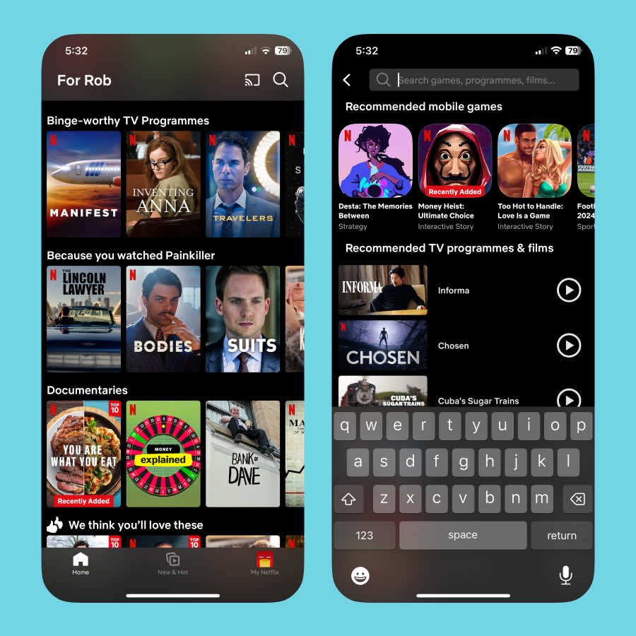
This is where an app has exposed the search input or button by default.
And by tapping on it, a search input is focused & the keyboard is revealed.
It’s a marginally better approach as it’s essentially the same as the reachable approach, only without that reachable button creating an extra tap.
There could be numerous reasons for not including a search item in the bottom tab bar.
It may not be a primary feature of the app. In which case that’s fair enough.
However, when I look at the big players out there who use this approach, I can’t help but think search is important enough to be a high-frequency feature, and therefore worthy of a more ergonomic interaction design.
Apps that understand their users are asking to search for something when they tap a search input or button, yet have not understood how long human thumbs are:
- Netflix
- Monzo
- Slack
- TikTok
- YouTube
- GitHub
- Apple Mail
- Amazon
- Vinted
- Etsy
Why is mobile search interaction failing?
My theory is that two things are happening in the design processes of these companies
Guideline guardians
Firstly, Apple’s Human Interface Guidelines state that there are specific ways that the tab bar should work. And this pushes design decisions towards providing a page of content that users may drill into.
Following the guidelines is good as users will expect your app’s interface to work in familiar ways.
But guarding design decisions by referencing official guidelines is sub-optimal.
I see no reason why this can’t be modified in the case of search.
It’s already a familiar interaction to tap on a search icon and immediately be able to type your search query.
Plus, it’s more useful as it offers what the users asked for by tapping on that icon in the first place.
Competitive analysis for the win?
Every design team will look at their competitors at some early stage in their design process.
That’s great! But only if you’re using this activity wisely…
Competitive analysis gathers paper-thin knowledge about what other companies have decided to do. You don’t know why, or whether it’s really successful. learning that requires different research methods.
It’s best used for inspiration, and guidance on further research. That’s about it.
I suspect there’s a healthy dose of companies copying each other here due to a lack of understanding on what they’re really learning by staring at their competitor’s mobile phone apps and noting down how they work.
The rare cases where good search interaction happens
I’m still on the lookout for more examples of mobile search being implemented well.
Right now I’ve compiled this (very) short list of those who have applied some god critical thinking to their app’s search interaction:
- 1Password
- Ebay
- IMDB
Let’s celebrate the design teams in these businesses.
They’re demonstrating to the world that they understand ergonomics in design.
They’ve matched Google’s world-class search design, and while that’s a simple thing to code, it’s much harder for businesses to untangle themselves from convoluted processes that result in poor user experience.

About the author
Hi, I'm Rob
I make digital products that help improve people's lives.
After working my way up to the top of the design function in my earlier years, I began a broader role with a new startup - Life Moments - in 2018.
I've been a pivotal force in shaping and operating the business from its inception to profitability and beyond.
Find out more about my career.